A Comprehensive Approach to Understand Responsive Web Design

Table of Contents
Your website represents you, your brand, and your business vision altogether. A perfectly designed and developed website is essential to attracting your potential customers.
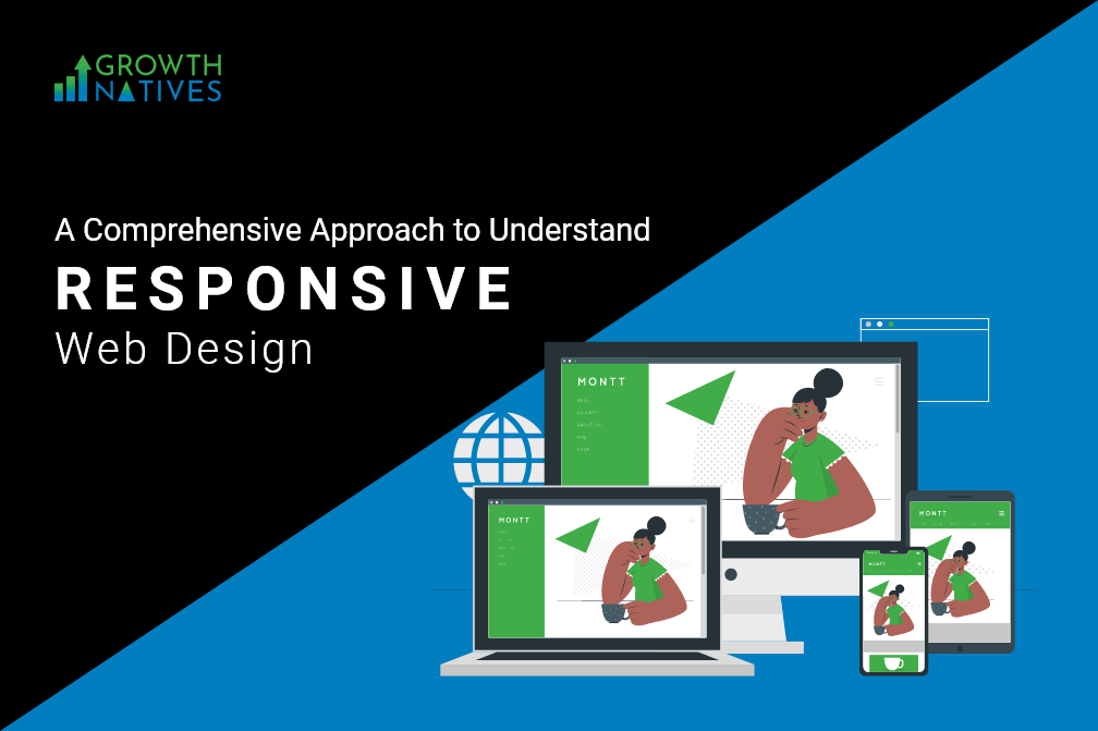
Earlier, the primary goal of any website used to be providing a seamless browsing experience for desktop users. But times have changed now! As we took a step toward mobility, things drastically evolved, especially in terms of how websites are designed. Apart from making a website look alluring, designers today need to make sure it functions well on every platform, be it mobile, tablet, or desktop. Responsive website design helps in accomplishing this goal.
A responsive website amplifies your chances of getting increased website traffic from desktop as well as mobile sites. In fact, responsive website design was first introduced in 2010 with a vision to create a design that not only looks good but also works well for every screen size.
A report from Statista shows that in the fourth quarter of 2021, 54.4% of global traffic was generated through mobile devices, excluding tablets. Also, 85% of users believe that a company’s mobile website needs to be as good as their mobile website.
This is how big the mobile industry is for companies trying to generate traffic and boost conversions. Thus, if you are planning to build a website or revamp one, make sure it is a responsive one. To know more about responsive design and the challenges you might face when implementing it, stay with us till the end.
What Is Responsive Web Design?
A responsive design means a technique that makes the website equally aesthetically good and functional for different platforms or browsers that it appears on.
Gartner explains it as “a client-side technique designed to support different layouts in a single web instance.”
A responsive website is the pillar of a great user experience. It gives your website visitors complete control on how they see your website. If you have a responsive website, users see an impeccable website with no missing pieces, no blur or cropped images, or no missing content, regardless of the device they are using.
Adaptive Vs Responsive Web Design

- Responsive design indicates that the design is fluid and can adapt to any screen size—desktop, mobile, or tablet. In responsive design, CSS media queries are implemented that result in changing the styles of the screen such as width, height, resolution, device type, etc.
On the other hand, adaptive design uses static layouts that fail to respond once executed/ loaded.
- With a responsive design, you are free from the hassle of creating multiple websites. You only need one website that has all the right components such that everything falls in place, and it responds and adapts to any device or browser.
Unlike it, adaptive website design creates different layouts that adapt to the users’ screen size. You need to create multiple pages within the same website to fit in the desired screen type.
- Responsive websites use media queries that target the breakpoints to scale the content such as wrapping text, adjusting the layout, and creating fluid images, so that the website easily fits into any screen. This process is carried out by using HTML and CSS.
An adaptive website also uses media queries of responsive website design, but adaptive design adds JavaScript to change the website HTM based on the requirements of the device.
Components of Responsive Web Design

Fluid Grid
A fluid grid design is an integral part of a responsive website design. A fluid grid is a technique that allows you to design a layout with a flexible layout which helps in automatically resizing to the desired screen size.
Flexible Visuals
One thing that makes your website more attractive is images. But when images are not correctly placed or are cropped or blurred, it may hamper the user experience. Responsive website design comes with a flexible visuals feature that helps in creating visuals in the perceived size. All in all, it provides you with scalability that changes the visible area of your web page.
Read More: Growth Natives Is Now A Top B2B Website Design Company According To DesignRush
Media Query
The screen view of your website drastically changes from one browser/device to another, which is why you need functionality that can change the website layout depending on the screen and browser. Media queries are used in CSS in order to create a responsive website design. With this component, the designer can add different layouts by using the same content block. Media query follows rule-based parameters that include browser, resolution, and orientation.
Responsive Web Design Challenges and Solutions

Managing Navigation
Challenge - Having a navigation menu significantly decreases your chances of bounce rate, as it works as a roadmap, directing your website users throughout the web page. In responsive web design, the navigation menu needs to be scaled with respect to the screen size. However, it should be easy to connect. This means your navigation menu should not change with the screen size or type as it may end up confusing visitors.
Solution – Create an intuitive and self-explanatory navigation menu for all screen types.
Browser Compatibility
Challenge - The goal of your website is to work seamlessly and look attractive on all platforms. This means that depending on the screen type or device type, the behavior of your website should not change. Media queries allow rendering content precisely depending on the screen’s layout. With rightly created media queries, websites develop the same behavior across different platforms, that is, you can display different layouts flawlessly across platforms.
Solution – Adding JavaScript can help in making the desired changes to the page layout so that it can adjust the screen resolution based on the device type.
Responsive View
Challenge - One of the most challenging aspects of website designing is to make sure it provides a responsive view, whether it is on desktop or mobile screen. For instance, if your website uses padding of say 200 pixels, it will look perfect on the desktop. However, when viewed using a mobile device or tablet, the same website will look disoriented, misaligned, and ragged, which will create a negative impression on visitors.
Solution – The simple way to fix this problem is to use the fluid grid method. Interchange the old school way of using pixels with a responsive way of percentage. This is because the percentage displays the website design based on the screen resolution and size. If you are viewing a website on a small screen, the content will be shrunk and adjusted accordingly and vice versa.
Loading Speed
Challenge - Website speed not only impacts if visitors stay or not but also affects your SEO rankings; no one likes a slow-loading website. Responsive websites are known to slow down website loading speed as the traffic comes from multiple devices. And the more the traffic, the slower the website.
Solution – The simplest solution available is using conditional loading.
Conclusion
With the cut-throat competition, it has become essential to create exceptional and responsive web experiences for your end users. A responsive website design will take you one step closer to engaging your prospects successfully and converting them to your bankable customers.
If you want to optimize your website for responsiveness and more unique and satisfying user experiences, our experts at Growth Natives can assist you. Learn more about our website design and development services or write to us at info@growthnatives.com
Author Box
Sakshi Arora
Sakshi Arora is a seasoned content writer and editor with extensive experience across various industries including B2C, B2B, travel, e-commerce, and IT. In her free time, she enjoys expressing her creative side through painting and writing poetry. She also finds solace in nature and has a deep spiritual connection. Music brings her immense joy.


